Here, at quintly, we process a lot of data. We also present a lot of data. The presentation part was always challenging, as we do give the ability to really drill down to the columns that you want to see. This obstacle is also a natural result due to the nature of our product - full customization. The most affected by those were any of the table metrics.

We have been working in the background to tackle how the reporting is being handled. The following updates will definitely address a lot of the challenges that you might have had in the past. Let's dig in:
Headers revamp
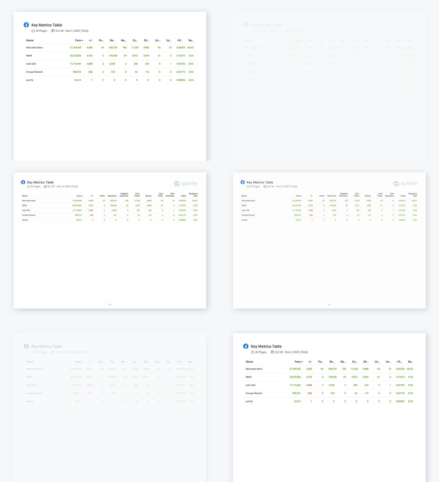
We have drastically optimized readability for column headers in table metrics in both exports and reports.
Orientation flip
Our reports are now being rendered in the Landscape mode to improve the readability of those columns heavy tables. We have also improved the horizontal space for easier read through.
A lick of paint
Our reports have a fresh new cover page and we also have changed the styles across the reports
All of those changes are available right now and are related to both Exports and Reports PDF functionalities. We are sure that this update will help you to present your results in an even more clear way. More updates about reports will be coming in the following weeks, so stay tuned.

Join the conversation. Leave us a comment below!