
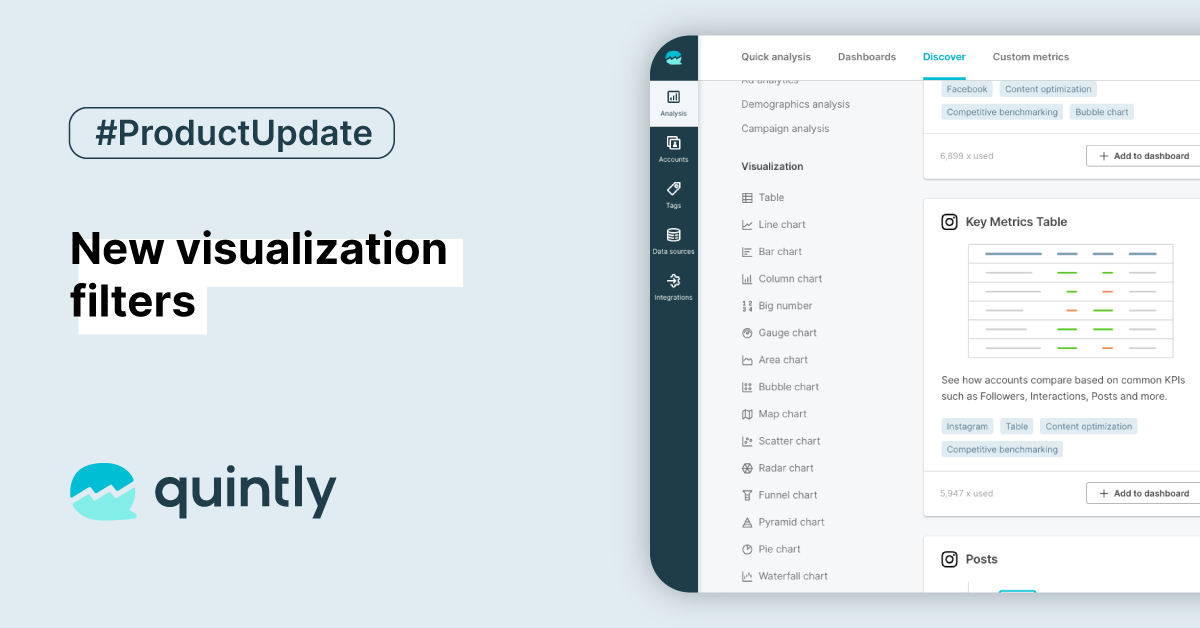
As our default metrics section, "Discover", continues to grow, reaching over 650 metrics across multiple networks and use cases, we have added another way to filter them quickly. You can now refine your results by using a visualization filter.
Where to find it?
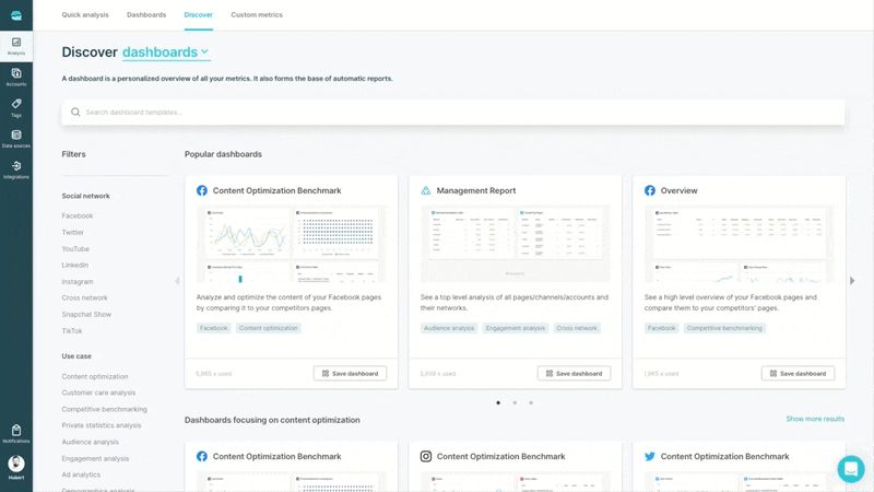
Navigate to the discover section, select "metrics", and choose which visualization type you are interested in in the filter sidebar. We currently support Table, Line chart, Bar chart, Column chart, Big number, Gauge chart, Area chart, Bubble chart, Map chart, Scatter chart, Radar chart, Funnel chart, Pyramid chart, Pie, and Waterfall chart.
You can combine the visualization filter with "social network" and "use case" filters to narrow your searches.
It is worth mentioning that the icons introduced with this update are also used in the "Analytics" section to quickly identify the type of the chart in your "Favorites" or "Top 10" lists.
This improvement should help you quickly identify the right metric for you or even discover a completely new one.

Join the conversation. Leave us a comment below!