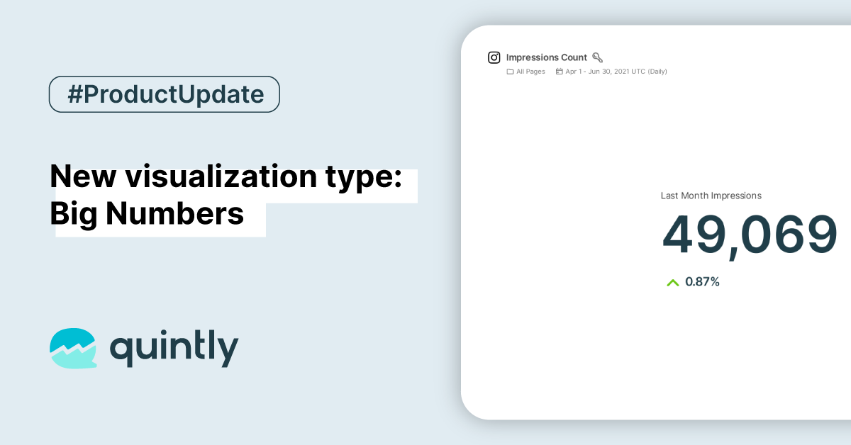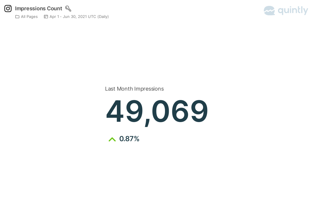
We’re very happy to announce that you can now present your data in the Big Numbers format. This is a particularly useful feature if you want to highlight a single metric making it visible in the dashboard as a summary, e.g. reach, followers change, and more.

What is the Big Numbers visualization?
Alongside the other chart and table types, Big Numbers are introduced to represent a single metric in a more focused way. It contains a single number that can be related to followers, posts, likes, etc., or an average number per day over time, for example, average reach over time. This can also be accompanied by a secondary percentage number that represents a change in comparison to the previous period.
How to get started?
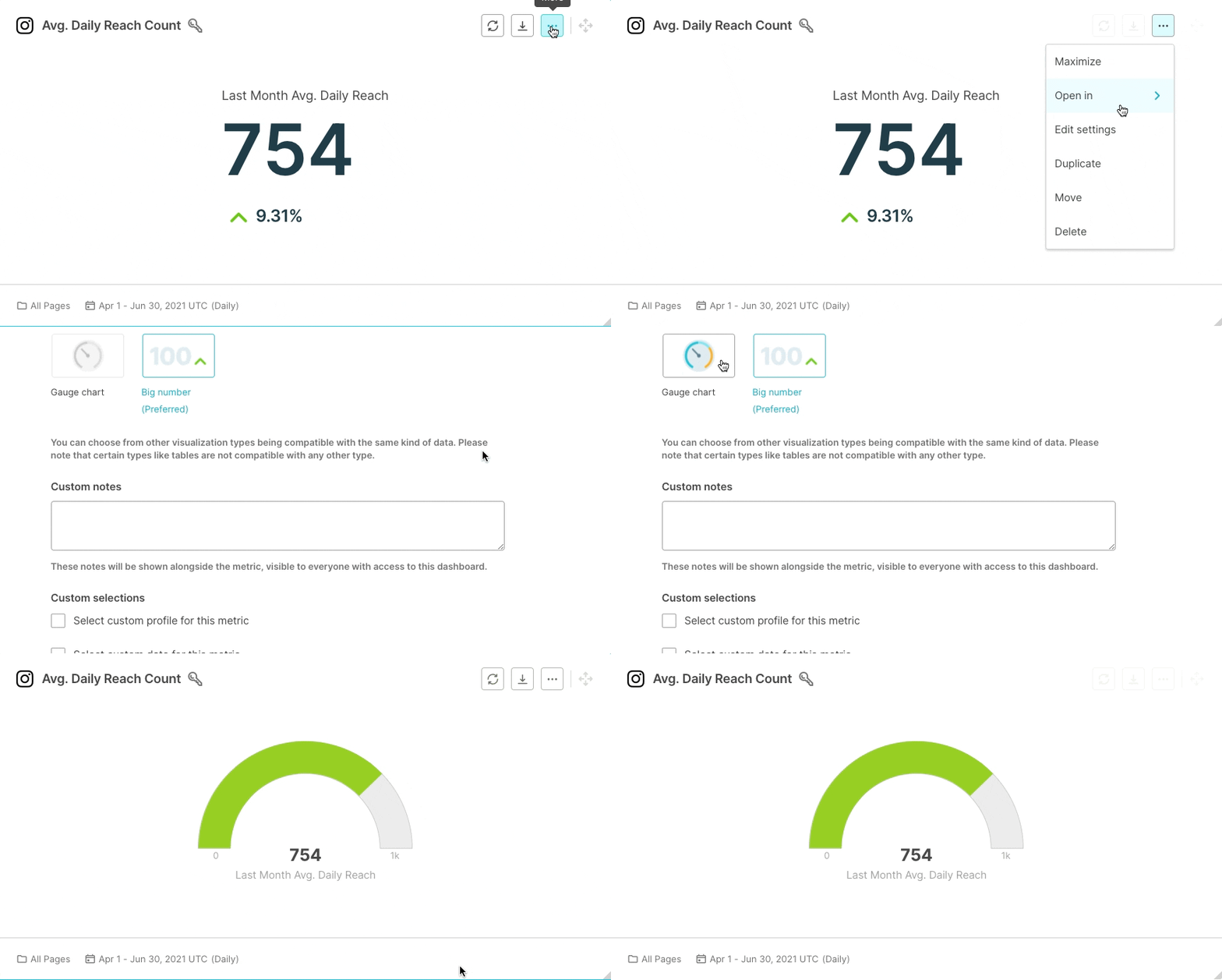
We have created a set of default metrics for each social media network. Visit the “Discover” section, select one and add it to your dashboard. You can always customize or create new custom metrics using our metric builder. It is also worth mentioning that Big Numbers visualization is interchangeable with the gauge chart.

Conclusion
We’re pleased to deliver this new way to present your data. In a true quintly fashion, you can even further enhance your dashboards, exports, and automated reports with single number metrics. Our clients are always looking for more story-driven reporting, and we feel that this release, alongside the recent "Custom Notes" update, is making this goal easier to achieve. We cannot wait to see how our customers will utilize this new feature; they did ask for it :)

Join the conversation. Leave us a comment below!