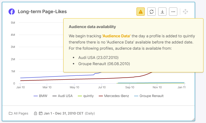


Warnings share important information for you to know when analyzing metrics in quintly. So far these warnings with their full message were shown at the top, leaving less space for the actual chart or table. To make warnings a better experience we have introduced a less intrusive warning icon in the header of a metric, showing the full warning message on click.
Hubert is a Tech and Product enthusiast with over 17 years of experience spanning from Startups, Ecommerce, Creative Agencies, SaaS and more. Currently he is leading Product Marketing and Content team at Facelift.

Get in touch today to track, benchmark and optimize your social media performance with advanced analytics made easy.
Join the conversation. Leave us a comment below!