quintly Blog  /   Improvement
1 MINUTE READING TIME
Improvement

Chart type visualization in drop-down menu 📊📈

by Hubert Grzesiek on September 25, 2018

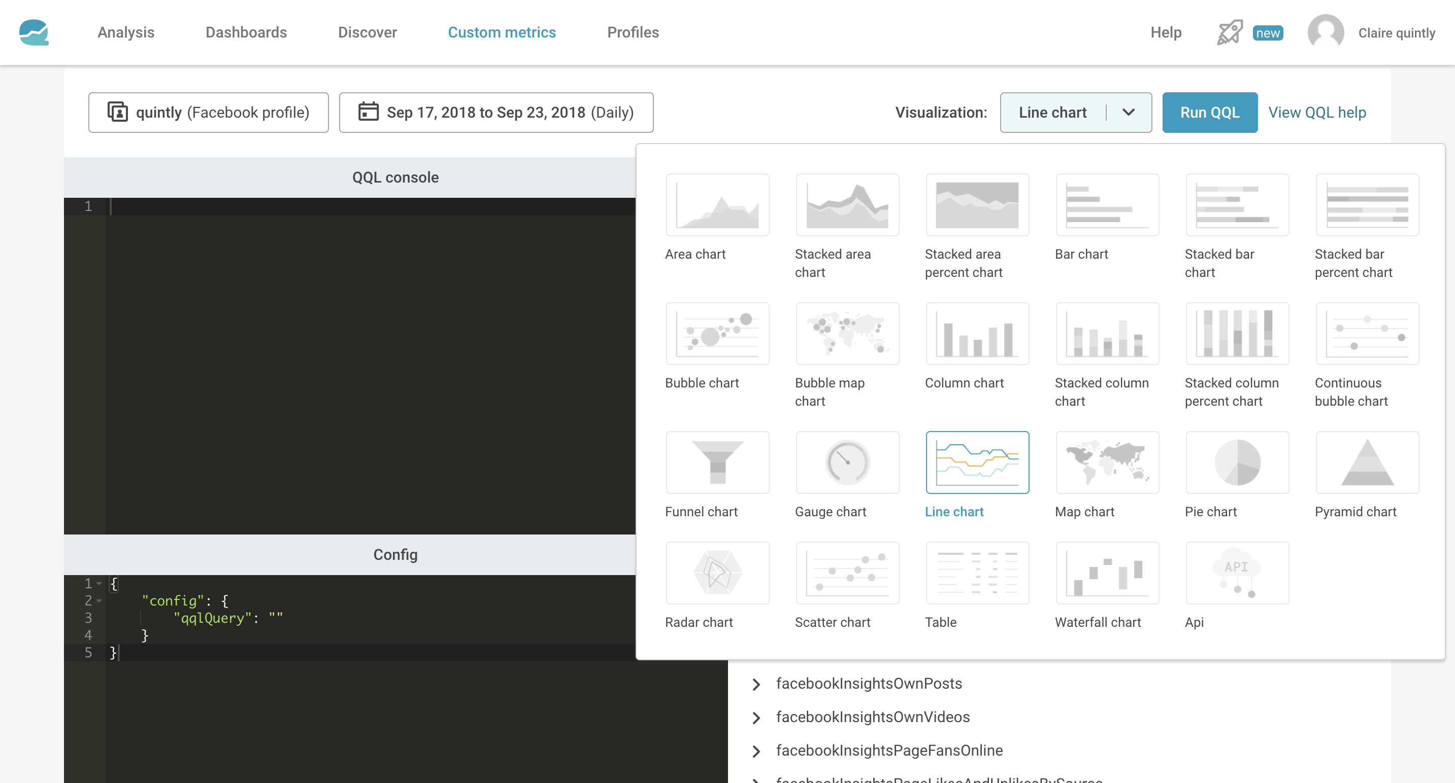
When selecting a chart type visualization in the drop-down menu, you will now see an image of how the chart type looks like. As we offer many chart types they are listed in alphabetical order and related charts are grouped together.


Read more about building metrics on our knowledge base here!

Related Categories

Improvement

Hubert Grzesiek

Hubert is a Tech and Product enthusiast with over 17 years of experience spanning from Startups, Ecommerce, Creative Agencies, SaaS and more. Currently he is leading Product Marketing and Content team at Facelift.

See where you stand on social media.

Get in touch today to track, benchmark and optimize your social media performance with advanced analytics made easy.